Saturday, July 16, 2011

Bali 5 - Snorkelling!

First time ever snorkelling and I'm hooked like a fish! But fish like I've never seen before. There were so many things I didn't know and hadn't seen.


Even though I've been told that the white pieces of coral one sees on someone's ornament shelf along side pretty shells and ceramic bowls were dead and just the bones of the creatures, still, it didn't really sink in. The truth is, I've held in my mind's eye a picture of a coral reef as a tangle of white boney shapes with some fish swimming through. Not a garden of shapes, colours and textures! The ones that surprised me the most were the big flat table corals, like giant mushrooms spreading out. There were shapes like fans and snaky tangles with hairy bits. Then the brain corals looking for all the world like brains and spongey things and weird blobs of all sizes. The corals were red, green, purple, lavender and many subtle gray-browns. I was very surprised that they weren't all connected. I thought that was what a reef was. Instead I could see the sandy ocean floor. And then the fish! Of course I've seen lots of tropical fish in aquariums, but what a thrill to see them living their fishy lives right there in front of me! Amazing shapes and colours. Neon blue, stripy yellow and black ones, fish with beautiful curvy fins, fish in large schools - oh my oh my! And then everything surrounded by the most beautiful turquoise sea.


I felt as if I was in a dream world. Along with what I was seeing, was the lovely sensation of floating in the sea. It is all so amniotic. Fairyland of a different sort. (There are many Fairylands in my consciousness!)

I think what I liked most was the delight of something so new and different. It shook up my sometimes jaded eye.

Tech Notes and Credit
If the technology is working properly you will see some wonderful photos here of the coral reef I've been describing. It was great fun chasing a fish to try and photograph it - often the subject swam right out of the frame just as I clicked. As you can imagine, many were deleted. Although the pics here are the ones that I shot, I must give credit to Peter for researching and organising the technology for us to do this.


We are using our Panasonic Lumix DMC-TZ5 with an amazing housing made by Panasonic specifically for this camera. We call it the Carapace. It allows us to manipulate all the camera controls underwater and has (as you can see) this amazingly clear plastic right in front of the lens. It also has a superb gasket sealing the whole thing. Glorious piece of technology.

Speaking of Peter, if you aren't already doing so, you might enjoy reading his take of our Bali trip:

http://uhclem.livejournal.com/


- Posted using BlogPress from his iPad

Location:Amed, Bali

Tuesday, July 12, 2011

Bali 4 - Fairyland (Deconstructed)

I like to breath in the countryside of a new land when I travel. It is as though I don't quite understand what I'm seeing until I've had a sense of both the natural world of this new place and its cultivated agricultural sister. I walked with my mother in Spain in the mountain villages of Andulucia - sweet air filled with almonds groves and honey scented yellow broome flowers. In Ireland there is all that open space of turf bogs, fields of grazing sheep, interspersed with stone walls, farms with white cottages and villages with pubs called Finnegan's.

While we've stayed in various flavours of urban settings here in Bali, we've also been exposed a little bit to the countryside. Yesterday there was a long visit to the jungly wilds of a botanical garden, which felt like walking through a Rousseau painting - big leafed plants flopping about, orchids, palms, bamboo, bird of paradise flowers and many plants I only know in their potted versions. The most extensive exposure has been a marvelous day spent bicycling with a guide through 32 kms of rice fields and villages.


I was not at all prepared for the Balinese rural countryside. As we bicycled through the main road of villages, I was amazed to see high walls on either side of the road. Not waist high walls to keep livestock in, but two metre high walls that you can't see over! A number of generations of family live together in these compounds, and then the compounds are strung together with no gaps between the walls. Sometimes there is a shop selling noodles and pop bottles full of petrol which opens onto the road and there are dogs and chickens and children wandering around, but the walls still dominate. Inside the compounds are a number of buildings, some with a roof but no walls and a temple with walls but no roof. The temples have many tall square towers. These are the compound shrines. Sometimes they have statues of gods or demons in front of them, though often there is nothing (to my eye) inside. They always have fresh offerings with flowers and incense. The outside of the shrines are usually wrapped in gold or black and white checked cloths. Over top are ornate, brightly coloured parasols. So what you see cycling down the road are high walls with towers wrapped in pretty cloth and umbrellas sticking up. Then, because it is the holiday Galungan, the street is decorated with (as mentioned in Bali 2), miles of bent bamboo poles decorated with punk haircuts of coloured rattan. And, because of that same holiday, this is an auspicious time to get married. There were many compound entranceways done up to the nines with loops and frills and archways made of rattan and woven palm leaves.


In between the villages are the rice fields - mostly bright bright green and stepped into different levels. I always thought rice terraces were to do with maximising the land on hillsides. These fields at different heights are to do with an elaborate irrigation system where the water flows from field to field. Every field has a shrine. Scattered about between the rice paddies and in front of the walls are beautiful flowers. I saw a giant poinsettia plant (with no Christmas decorations near it)!


What did all this Rousseau jungle, ornate whimsical decorations, wrapped towers, stone dragons and stepped rice fields look like to me? Fairyland. It seemed like a magical other world. Exotic. Mysterious. Eastern. Oriental. Other.

So let's just deconstruct that a bit. (Some of you will know that I'm starting graduate school in the fall - just getting the post modern, critical theory engine revved up here.) All right, I know that real people with complex lives that include television and motorcycles live in those villages; that working in rice fields is a back breaking way to scrap out a meagre existence; that tourism with all its ills offers an economically better lifestyle. So where do my images of fairyland come from? I was read many fairytales as a child - Hans Andersen and the Brothers Grimm as well as tales from around the world - Chinese, Russian, Indian and other stories. Many of the illustrations in these books were by an Irishman named Harry Clarke. Lush, patterned images with swirls and curls and saturated colours. He was very influenced by Art Nouveau, Art Deco and the French Symbolist movement. (Thank you Wikipedia!) All those Europeans making the East exotic. "Orientalism" as Edward Said called it (though he was referring to Western eyes looking at the Middle East, not south east Asia, nonetheless, the term still stands here.)

Middle age is an odd time. I see my exotic fairyland and at the same time I see my deconstructed Orientalism. Do I see truth? I'm guessing it is all just layers of seeing.


- Posted using BlogPress from my iPad

Location:Ubud, Bali

Friday, July 08, 2011

Bali 3 - Intricacies

I spent much of last year drawing trees. They are surprisingly difficult to draw as all that foliage is a messy tangle to wrestle into some kind of order. Obviously one can't draw every leaf - you'd go mad. Artists have solved the problem in different ways. Draw the overall shape of the tree and imply the detail; give a bit of detail in the foreground and imply the rest. Much Indian and Balinese art solves the problem by stylizing the leaves into simplified repetitive patterns. The patterns then bump up against one another to make gloriously intricate designs.

Today we visited a museum which showed a lot of what is called modern-traditional Balinese art. I think what that means is traditional subject matter (mostly narratives from the Hindu story cycles, the Ramayana, the Tantri Kamandaka, (no, I'd never heard of that second one either) and folklore) using more modern techniques. I liked best the black ink ones from the 1930s. These older images showed very little perspective, though there was enough shadow modelling to show a tree, tiger or demon as 3D. But what I really loved is how every part of the image is covered in pattern. The water has a pattern of waves, the leaves are shown in a pattern, the tiger is all repetitive pattern, the god of a thousand heads (so cool!) has a myriad heads turned into pattern and then there is random pattern filling in any left over spaces.


And speaking of pattern, there is the intricate wooden carving - how do all those curlicues and swirls work together? Stone carving too, though now much of that is cast into concrete. I was drawing a dragon-demon from a concrete entrance way this morning and was amazed at how all those stylised pieces of wing and horn fit together. And, supreme amoung pattern, there is the fabric. Batik, ikat and modern prints everywhere. For sale, yes, of course, but many men and women still wear beautiful sarongs. Here the patterns are layered over and over one another in a riot of colour and design.


So have you ever tried to put different patterns together? These are so formal, so complicated and done without Photoshop! What a mind, what a way of seeing the world that can produce such complex intricacies. I'm in awe.


- Posted using BlogPress from my iPad

Location:Ubud, Bali

Wednesday, July 06, 2011

Bali 2 - A Silver Lining with Monkeys

It had seemed like a good idea. The brochure said it was going to take us to good snorkel places, introduce us to sea turtles, show us a hidden beach, walk us through a magnificent temple and end the day with a grilled fish barbecue watching a beautiful sunset. It sounded like a deal to us! (The fact that the brochure was the garish product of a large corporation, offering 10 different packages and was clearly (in hindsight) aimed at a different kind of tourist than us, slipped our notice.) The beach was crowded with noisy boats; at some point the young boy steering ours at high speed stopped it up against 20 others and pointed into the water. "But where is the reef?" said Peter looking through the glass bottomed boat into some cloudy green water. The boy indicated over there and over the side we went. The best thing I saw were some divers learning how to use their equipment underneath me and one lonely blue and yellow fish. No coral, no groups of fish, no sea anemones - nada. Very disappointed and a little pissed off, Peter, I and the young Singaporian couple who had taken the same bait, climbed back into the boat. The turtles were even more of a swize. By the time we had met up with our (very pleasant) driver again, the 4 of us were none too happy. The next stop was "Dreamland' , a not so hidden beach where surfers played and the tourist industry is building huge villas. Peter did have fun getting knocked about by the waves and I liked the people watching. Finally the temple, with busloads of other visitors.
So what was the silver lining? The most interesting part of the day for me was driving around southern Bali seeing how people live. That and the monkeys.
The driving is crazy - high speed and narrow lanes with millions of motor scooters swooshing around between cars, buses and trucks. Children and dogs play precariously close to the road. There is a great humble jumble of life occurring just a few feet back. Houses and shops have their fronts open during the day so you can see the bottles of pop being sold, the women cooking and the concrete forms being poured. There are many billboards advertising many familiar products. To my surprise, lots of the signs are in English. I'm not sure if those are just for the tourist trade, though I saw a hospital listing all its departments in English, so that didn't make sense. Amidst all this commerce, people were putting up the most fanciful, glorious decorations - huge, flexible bamboo sticks which bend over the street like lampposts and were covered with bent ribbons of rattan in Dr. Seuss like crazy, spiky arrangements. These are in honour of a religious holiday starting today called Galungan. So, I liked the drive.


And how could I not like the monkeys at the temple? Gray, furry monkeys walking around, grooming one another, having sex, nursing babies and generally watching the world go by. All looking like reflections of ourselves, only with longer tails. We had been warned to leave our hats, bags and eyeglasses in the car. There were three young women walking just ahead of me when I saw this monkey suddenly set his sights on them. Lickety split her foot went up and Mr Monkey had her flip flop off in a second! And he wasn't giving it back; he just sat there with the purple flip flop in one hand and the nice piece of yellow banana in the other. We figured the old woman who sells the banana and the monkeys have a deal - the monkey steals the flip flop, the woman makes the sale and the monkey gets the food!
In the end a very interesting day; just not the one I had expected.


- Posted using BlogPress from my iPad

Location:Southern Bali

Monday, July 04, 2011

First Impressions

Remember geography lessons in grade school? Angles of the sun, solstices, seasons and the equator? Here I am very close to the equator at 6 in the evening of my first day in Bali and it is starting to get dark - how can this be? The sun is up for 12 and down for 12 - equal all year around. On what seems to me to be a hot summer's day, it is very odd for the light to disappear so early.

The 20 minute drive late last night from the airport to our hotel was strange and dreamlike. I saw weird, round buildings with frilly edges rising out of the darkness. Palm trees flickered by in the city lights. Like Vietnam and Laos, the only other parts of Asia I've been to, there were stores with big garage doors that open onto the road. The most dramatic sight were two huge statues in the middle of roundabouts: one was a gigantic depiction of Krishna driving a chariot with five dynamic, fiery horses pulling in all directions; the second another huge god carrying two fallen bodies. Nothing staid, pompous or still about these two.

And this morning I draw the curtains and go out onto the balcony to see steep rooftops covered in thatch, carved lattice work on the edge of the roof, lots of palms, flowers and greenery. The smell of charcoal and incense and lots of birds singing. Oh that feeling of anticipation and excitement about new and different to come!


Still jet lagged but too excited to sleep, we go out this morning for the first look around. Frangipane and bouganvilla flowers are everywhere - yellow for the former and cascades of magenta for the latter. Many people persistently ask us if we want to rent bikes, motorcycles or taxis - I remind myself Bali is a mostly tourist based economy and people are trying to make a living. What strikes me most is that every shop, every entranceway, every temple, every everything has an offering. Little or big, these are beautiful arrangements of flowers, leaves, fruits and sometimes incense in bowls or small bamboo easily made baskets. There is often no water, so they are just made anew each day. How amazing to be in a society where people weave such beauty and meaning into their daily lives.


- Posted using BlogPress from my iPad

Location:Sanur, Bali

Saturday, July 10, 2010

The Value of Art


On the first day of my exhibition, Tree of Life, I sold my image, Cherry Blossoms, to a woman who had never bought a piece of art before.

Some people buy art as an investment. One day Artist X might (hey, gambling is about risk too) become famous and abracadabra, lots of money is made. But there is more than one kind of value.

When I was a girl, my mother gave me a small wedgewood vase for my birthday. You know traditional wedgewood: neoclassical imagery - an 18th century fantasy of ancient Greek women and children in toga-esque gowns flowing in white relief over a dusky blue background. Images a romantic girl would love - and I did. As well as feeding my dreams of fancy ladies preening, my mother was also teaching the glorious lesson of feasting my eyes on beauty.  As a young teen, she once gave me two posters - a Chagall and a Braque - the art to see in the world was getting more complex. And on my 21st birthday, she asked me what object of hers I would like as a gift. I said, "The Goya print" - an image of a captive man writhing in tortuous chains. Like my mother before me, finally, in my thirties, I put it in the back of a closet because I found it way too graphic and painful to look at. At 21 did I really not understand that the image was straight narrative - Goya chronicled the horrors of war  - as well as working as metaphor? Somehow I didn't. I hung the picture next to Bosch's Christ Carrying the Cross where Christ is surrounded by a sea of seething, grotesque, distorted humanity. I can't quite access anymore what it was that my young adult self got from looking at this pain. (At the same age I also thought grungy bars were about REAL LIFE.) With all these gifts, my mother taught me about the value of art.

I like living with art. I have a marquetry piece it is of a floating boat constructed from carefully cut veneer shapes made by Ontario artist Stephen Haigh. I never tire of this picture. I float with the boat. Sometimes it reflects back to me an existential aloneness. Sometimes I delight in the 'trick' of the wood grain being the misty horizon line. In our kitchen is an acrylic painting by now deceased Ontario artist Kathleen Brindley of a glorious bunch of beets flying through the wild blue yonder. It conjures for me the same joie-de-vivre that Kathleen had, despite her hard life.

I could see that the woman who bought Cherry Blossoms loved it. She spoke of how hard it is to do things for herself. Once, in a time of prolonged gray, winter misery, she had called up a friend and, very spontaneously, gone for 4 days to the Bahamas. There she swam with dolphins, felt the sun on her skin and remembered that the life of Life was still there. She said that my painting gave her the same feeling.

There were a number of transactions between the woman and I. One of them involved money; another occurred on a different plane. I took a piece of my vision and with craft and experience, I wove it into my painting. Living with Cherry Blossoms, her Seeing is a little deeper, a little richer. That's value.

Monday, July 05, 2010

Obsession


My studio mate asked me a few days ago if I was relieved that all the artwork was finished for the show. Yes! The fear that I wouldn’t make it is behind me; there is all the other work to do – photographing and cataloging, organizing the food for the reception, more invitations to send out and today, hanging the show. So yes, I’m relieved, excited and looking forward to the next chapter. 

But there is another side to this story as well. The truth is I already miss the obsession of working on the show. It is a little healthier than some addictions, but it is still an addiction. When I am in the grip of obsession, I know what I have to do in the morning. There is a force that is steering the boat and I am just along for the ride.  I’m having supper, I’m thinking about the next piece of art. I wake in the middle of the night gripped by the next coat of varnish/soft gel that has to go on. I’m looking out the car window at trees and thinking about new ways to capture their forms. I love this feeling. I love the amazing power it has. I worked 12 hour days for almost 6 weeks straight. When I’m possessed I do yoga every morning, eat healthier and get to bed on time. All that matters is the art. The rest of the world barely exists.

And that, of course, is the problem – the rest of Life. I fortunately have a loving, supportive partner who not only puts up with my emotional disappearance but also aids and abets me with delicious meals and taking over the household management while I am gone. But you can’t say it is a balanced way to live.

So I am returning to the complexity of Life. Now it is time to figure out how to cook again with a broken foot and crutches. While I was possessed, I hardly noticed that I was disabled!. I’ve just  taken in that the seasons have turned from spring to summer. I begin to read the paper again. My long suffering friends will get phone calls, my dog will get more playtime. Most of all Peter will no longer feel he is living alone.

Healthier, but I sure do miss the Force.

Sunday, July 04, 2010

Exhibition in Toronto


Click on invitation so that you can read it! And here are the details in case you don't:

Diana Meredith @ Red Eye Studio Gallery
Tree of Life
An exhibition of new mixed media digital art

Reception: July 8  4:30 - 7:00 PM
July 7 - July 25, 2010; Wed-Sun 12-5


RedEye Studio Gallery
The Distillery District
Case Goods Warehouse
Building 74 (east of Balzac’s)
55 Mill Street, Toronto
T: 416-366-3393

Thursday, July 01, 2010

A Material Girl


In the 70s I went to Sheridan College School of Design and Crafts here in Ontario. In our foundation year we tried out lots of different crafts and, in the latter 2 years, I specialized in ceramics. While in school I made ceramic sculpture and, after graduation, I went on to become a potter. Life took some odd turns, the way it does, and I lost my creative way for many years. Now I’m firmly back on that path and I find that that craft training I had back in the beginning is very central to my way of creating.

I understand now that the way I was taught to be a potter carried with it a particular philosophy and aesthetic. At the time I was just an 18, 19, 20 year old having fun making pots. It was the early 70s and so some of the ideas I received at school were part of the hippie zeitgeist of the times - handmade was good, natural materials were good, mass production and plastic were bad. We were taught that making objects well mattered. It was as important to make the underside of a teapot, chair or rug as finished and beautiful as its public face. We were taught that Form followed Function. One defined the purpose of the object and then found the simplest form that met the purpose. We were taught to know and respect our materials, that the material itself, the clay, wood, silver or wool would guide us in the making of the finished object. We were taught that techniques mattered, but that they weren’t an end in themselves. Design and ideas were equally relevant. In ceramics we followed the tradition of Bernard Leach, the English potter who had studied in Japan in the 1930s and, in the mid to late 20th century, was considered the father of western studio pottery. Chinese, Korean and in particular Japanese aesthetics were held up as the paragon of beauty. No curlicues or ornamentation for us. The Japanese Tea Ceremony was preached, though, I confess now, that my understanding of it was rather sketchy - falling vaguely in my young psyche somewhere between English high tea and Catholic high mass (with some kimonos and hand made pots thrown in). We particularly took to a concept called Wabi - that the imperfection that happened in a creative moment was as important as technique and that an object that showed its Wabi - its mistakes - was more beautiful than a perfect one. Yet this couldn’t be done with artifice. The idea, the design, the making and the materials were really all one integrated act and the truly beautiful object would reflect this integration. I now see that it was all rather Buddhist.

The art scene at the time I was in craft and design school was busy throwing off technique and was embracing conceptualism and by the by, disdaining us craft types. We, on the other hand, felt as if we had secret knowledge about  beauty and how things were made. We secretly believed that there was no difference between craft and art.

Fast forward 25 years or so. I found my way back to art and, to my great surprise, found that the computer was my central tool. Working in Photoshop involved an almost vertical learning curve. I plowed through all that technique because I was so seduced by the immense visual possibilities offered. Early on I noticed that as I struggled (and oh I struggled!) to learn what particular tools or techniques were doing, my images were being shaped by the techniques. When I understood that Levels was controlling the shadows and highlights, I began to see the tonality in my images more clearly. Layer masking allowed me to melt my image components together seamlessly and lo and behold I was madly melting images together. As I dug deeper into the software, I secretly began to think that it was all rather like craft. If you don’t do your selections well, the image looks shoddy. Sometimes I felt as if I was shaping the pixels with my hands.

As my work developed I became interested in printing with all its attendant possibilities, techniques and problems. This led to what I’m up to these days – mixed media digital printing. I struggle to find a way to make acrylic paint and digital printing work together and as I do that – which is really an endless series of technical/design problems to solve – my images are shaped by that journey.

Now that my image making includes a large component of analog techniques, I’m working with my hands again. I’m preparing substrates, making patterns with goopy modeling paste, staining backgrounds with acrylic washes and discovering new ways of applying acrylic paint on top of digital ink. I love the feel of the tools and the materials. I love how the time passes as I roll coats of protective varnish over the final images. Recently, I’ve even starting studying Japanese brushwork, Sumi-e; so that I’m right back to that striped down, essential Japanese aesthetic I learned about in craft and design school.  I love that the more present I stay with my materials and ideas, the more powerful the work is. However, my 70s sensibilities have taken at least one major hit – ironically I work now almost totally in plastics. So much for the natural materials.

The images I make grow profoundly out of the tools, materials and techniques that I use whether they are digital or analog. My art making is a synthesis of my physical, emotional, intellectual and spiritual selves. I love doing it because I have to be so present & connected to make it work. This way of making images is grounded deeply in the craft education I received at Sheridan. I really am a material girl.

Monday, June 21, 2010

Doubt


A secret: It is not like every day is a great art making day. There are the doubtFUL days. They have scattered themselves throughout this project. It starts with nasty internal voices whispering and builds into a harsh cacophony: “You’ve run out of ideas;” “You don’t have enough work;” “This isn’t real art;”  “No one will come to your show;”  “You are a fraud;”  “Just who do you think you are;” “Get a real job.” Then there is the 2AM shift: “There is no way you can make a whole show’s worth of work in 2 months (1.5 months, 1 month, 3 weeks, 2 weeks, tick, tick, tick. . . ).”

These voices are old friends who have been with me for a long, long time. There have been chunks of life when I’ve let them run the show. They have had me gripped by panicked night horrors; curled into a fetal ball on the couch; or staring blankly at the corner of a room in a numb daze. I’ve been to therapy, done meditation, taken Prozac and prayed, let alone tried getting wasted in a variety of flavours. Somehow I’ve come through the worst of all this. Now these doubts only own me for shorter and shorter periods of time.

That’s where the pressure of a show’s deadline comes in. Sometimes, now, when one of these voices tries to make itself heard, I feel like a fed-up parent dealing with a truculent child. I sigh and say, “I’m busy. I don’t have time to indulge self-doubt.”

Lemon cake, champagne, milk chocolate & almond covered toffee, or not getting out of my pajamas until noon are my usual indulgences. Self-doubt isn’t an obvious candidate for this list. But, when I’m in my clearest moments, I know it belongs there. It is related to victim mentality – something that took me years to understand was actually a choice. (“Poor little me; I’m a helpless blob.” I don’t think so.)

The Latin roots of the word “confidence” boil down to ‘con’ and ‘fides” – with faith. Now I have more faith that I can make my art.

Wednesday, June 16, 2010

Why Trees?


You probably thought that I had committed myself to faces, that I was Diana Meredith, portrait artist. I’ve sometimes thought that myself. I like making faces, but for my current project where I am mixing acrylic paint and digital media, I wanted a different image.

Trees in summer are surprisingly hard to depict. They are so big and so amorphous. But our northern hemisphere trees in winter are simplified. I love that that great big form can be defined by all those negative shapes - the diamonds, triangles, rounded pentagons and weird twisty shapes that have no names. When I was in art school we had to do an exercise where we drew a tree by drawing its negative shapes. I sat in Queen’s Park and drew a small tree that forked from the moment it came out of the ground. I was amazed that defining the negative space produced the positive. For months afterwards I walked around looking at the spaces between objects, people, and moments.

Many years ago I saw a painting by Toronto artist, Lynn Hutchinson, that depicted the Tree of Life - a very stylized tree filled with birds, fruit, abundance and beauty. Somehow this image has stayed with me. I wanted to make my own Tree of Life.

Wikipedia and some knowledge gleaned along the way tells me that the image of a sacred tree has been central to many mythologies, religions and stories in lots of cultures. Norse mythology has the Yggdrasil at its center.  This is the World Tree that connects heaven, Earth and the underworld. What about the Buddha sitting under a Bodhi tree?  My mother always told me there were three sacred trees of Ireland - the Rowan, the Hazel and the Mountain Ash. Let’s not forget the garden of Eden, let alone Avatar. Trees should be central to our consciousness – they process all that essential oxygen for us.

The more I try and capture the essence of Tree, the more I’m struck by the large presence they hold. Giants that hold space with grace and without argument; those deep, invisible roots and the aliveness in the space underneath. There is a magic I want to get at.

As I make my Trees of Life, I’m struck with how full of joy, energy and presence they are. So that is a scary subject to address. For years my brother has told me that my images are full of anguish. And for a long time Anguish and Pain seemed like very important topics. The world has too many pretty pictures and it didn’t want to look at the icky side of life. I felt I was a serious artist if I was making images that depicted pain. But now in this patch of middle age it seems to me that joy is a much more daring subject to address.  Not superficial pretty, you understand. Joy that drills down, joy that strips away. Joy that is essence, wonder and connection.

Even as the body ages, or maybe because of it, I am making my own Tree of Life because my life feels very full of joy, connection and presence. That’s a gift.

Thursday, June 10, 2010

Organized Chaos


My recipe for interesting image making requires both a cup of chaos and an equal measure of organization. I’m not talking the organization of the material world - the printer isn’t about to run out of ink, there are paper towels, there are enough empty shelves on which to dry gesso covered substrate and the files are backed up on the computer. I’m talking about the image making itself. Planning, fore-thought - that  kind of organization.  You have to do a certain amount of problem defining and planning - my focal point is at too equal a value with the background; I’m going to lighten the background so that the focal point can be seen better. This area in the image is boring - how can I make it more lively? At the same time the chaos is needed for new ideas and new approaches  to problems. If there isn’t a component of chaos  and risk taking, you just solve the visual problems the same way each time. But if you have too much chaos, then. . .  well you know what happens: a big, disorganized mess.

So this idea of organized chaos has been with me for a long time. It is really how I organize both my living and my work spaces. I like to have a contained area, usually a table top or shelf or drawer which is always in a state of chaos. There can’t always be a place for everything because activities are in flux. I pull out a book about Klimt and stack it beside my colour tests and they are piled on top of my acrylic inks which are balanced precariously on the rolls of masking tape. This is the current chaos. As the project unfolds, the chaos increases. But, I contain it. Keep it to one area and keep everything else orderly.

How organized chaos plays out between digital and analog is very interesting. I can be much more chaotic (read: risk-taking, daring, but also unfocused & vague) in digital than in analog. Of course there is no Undo button in analog. I paint, then print, then paint again. That second go of painting needs to be done very carefully or I mess up the printed part. I need to see and define the problems more clearly. At the same time, my years of digital experience come into play. I want to desaturate that area of the image - how do I do that with paint without darkening the image?  In digital the elements of design can all be separated from one another more easily than in analog. I can change the value of a colour without changing the colour itself. In analog my intent has to be clearer. What I like about working in both is that I bring lessons back and forth from one to the other. 

Monday, May 31, 2010

Opening Doors of Creative Perception


In the last episode our hero had put aside her sensible, test everything carefully approach to art making, and, instead, had embarked  on a let’s-just-make-it-up-as-we-go course of action. Specifically the task was to try and save the white space on the substrate with the stinky, ammonia  based masking fluid watercolourists use. Acrylic paint was put over the mask, the mask peeled off and then the whole thing run through the printer. The idea was that the printed colours would print onto a white background instead of over the acrylic paint, thus the colours would be brighter.

Did it work? That depends on how you define work. Some of it worked and some of it didn’t work. In the process of fixing the parts that didn’t work, more doors opened up. Years ago I was struggling in therapy about which of a number of paths to pursue – art, writing or teaching. I felt I was in a long hallway with many doors. I worried that if I chose one, I would cut myself off from all the other options. The therapist wisely said, “Oh but when you enter a new room, many more doors will appear.” So here are more doors, more ideas.

I always forget until I’m doing it again, that the creative process itself is where the ideas come from. It is while I am trying to solve a visual problem that I come up with a new and different idea. I almost hate to say this, but I need the problems, so that I can find the new solutions, and thus the new images.

In this case the masking fluid worked on large, blocky shapes, but not on skinny lines because printer registration is an inexact science. So I have come up with a number of different solutions to first, fix the places where the registrations was off and second, to do it better and differently next time. For the former I have both over-painted and over-printed (though some new problems have arisen with both of these). But the latter solution is a radical new approach – paint, then photograph the painting, then make the image in the computer, then print the whole new image! Why, you ask, would I paint to begin with? Why not just paint digitally and forgo the mess and time of analog paint? Because there is a depth to the layers of colour and an aliveness to the brush strokes that is easier to get with acrylic paint than digital. Anyway it is more fun.

Tuesday, May 25, 2010

Throwing Caution to the Wind


By painful experience (the kind that really teaches!) I have learned that I have to test my materials. Last week I tested whether gold iridescent InkAid (the magic goop I use to print digital inks on top of acrylic paint) that has been shaken and let settle for 24 hours produces less bubbles on application than Ink Aid that is just shaken and used immediately. (It does, so now there are no little burst bubbles all over my artwork.) I tested which of my various acrylic gels and pastes that call themselves clear, actually are clear when I make textures on top of paint instead of cloudy. (Clear modeling paste turns out not to be clear – Grrr.) Previously I tested various finishing substances to protect my artwork from UV rays and abrasion, but now I want to do those tests again with new products as the one I used before is a dreadfully toxic aerosol and who wants to do that. The list of tests done and tests yet to be done goes on, but I think you get the picture.

I’m careful to make sure that I’m only testing one thing at a time. I have a little black book in which I write down what I’m testing and in red pencil I write what the result was. After I get the result, I write down what the next tests should be. I feel I should be wearing a white lab coat and have a clipboard. When I do these tests I feel very grown up and sensible.  However the problem with testing is that  it can go on forever. There is always another variable to consider. I really ought to. . .  And I get tired of ought tos. I’m in this game to see new pictures.

So today I took the other path, the one that throws caution to the wind. I just jumped in and did it and I’ll find out later this week if it is going to work or not. This was way more fun. I used the masking fluid that watercolour painters use to mask out the shape of my tree before I painted wild acrylic paints over top. Then I took the mask off and now the stylized tree looks all beautiful in white silhouette surrounded by a yellowy-green world. WooHoo!  But it might not work. (But I don’t care right now!) Tune in next week to find out what happened.

Thursday, May 20, 2010

One Thing Leads to Another - Part 1

I decided to change the sizes of my pieces for my upcoming Tree of Life show. Somehow as an artist one always wants to go bigger. My Vision – BIG! But there are the size limitations of my wide format printer (it had seemed so big!) and then the limitations of the framing/stretcher system I use. And big is scary. Mistakes are bigger mistakes – waste of materials and money, the effort chalked up to Learning Experience rather than a finished, satisfactory piece. But I’m ready to go up a notch.
So I plan for the new sizes. New sticks for the stretchers to be bought. New ¼ in. masonite templates to be made so that when I cut the substrate –pellon– the corners will actually be right angles (measuring exactly is embarrassingly hard!). Then I realize (after I’ve already asked my friend to cut the masonite) that  I need new work boards. These are boards I use to tape the pellon on while I add my various goos, gels, paints and potions. Because they all need time to dry between coats,  I tape the pellon to work boards so that I can move them easily around the studio. Bigger pieces means bigger work boards. So Kind Friend cuts the new work boards. There I am wrapping them in plastic when it occurs to me that the new boards are so big they won’t fit in the board storing slot in the shelving system. My huge, fabulous, organized studio and where are these going to live? Sigh.
It would have been so much simpler to stay with the same sizes. I think I’ve planned so carefully, but one thing leads to another. The boards are going into a temporary shelter. I’ll solve their permanent housing the next time I do a studio reorganization. For now it’s on with The Show and with whatever other unknowns are lying in wait for me down the path. 

Friday, May 14, 2010

Tripping Out on Canoes and Art

This week I started my new project – Tree of Life. I’m thrilled and terrified – all at the same time. I have a show opening on July 8 in the Toronto Distillery District. Eight weeks ‘til ShowTime!

So what do I know about the project? I know that I’m mixing  acrylic paint and textures with digital printing. I know that my initial subject is Trees. I know that I’m using iridescent InkAid (& iridescent paint) – shiny! I know that once again I’m working on pellon – that heavy, acrylic non-woven fabric used by the upholstery industry as facing for furniture.  I know my four sizes (+ one big one). I know that I  am working in Illustrator,  though of course Painter and Photoshop are always in the mix too.

I don’t know if I have time to do the paper collage thing I want to do. I don’t know if I’ll move past the trees to mix the images with bones or faces. I don’t know exactly what the trees are going to look  like. Most of all I don’t know where this journey is going to take me visually.

So this is the beginning of the journey – trying to find order in the chaos: planning the route, figuring out the drop off and pick up. What to take – is there going to be rain? snow? heavy sun? How bad will the black flies be, the mosquitoes? Can we still do long portages? Any rapids? What level? How high is the water this year? Do we take the dog or not? How do you plan for unknowns?

The creative journey really is a journey. Preparation and packing are just as necessary here as for a canoe trip. What are the parameters of this trip? What area is being explored? This the part I’m doing now. Overview and setting limits.


I woke up excited about it all today. Two days ago I woke up terrified. Who will I be at the end of this journey? How will I see differently?

Tuesday, May 11, 2010

Sumi-e

It has been an eye opening experience studying a different kind of art form. I’ve been taking a Sumi-e, Japanese ink painting, course at the Japanese Canadian Cultural Center here in Toronto. I wanted to study this so as to gain more control over my brushwork. I want to be more conscious as I used a brush.

The oddest aspect for me is that Sumi-e is taught by imitating set images. So over the 8 weeks the beginners start with an Orchid, move to Bamboo, visit a Plum Branch and end with Chrysanthemum. Collectively these are referred to as the Four Gentlemen. Success is one’s ability to mimic the given image. It is not easy. We are working with a variety of tonal values on the brush. The strokes are very alive – I need just the right amount of pressure and just the right amount of wetness/dryness on the brush. Imitating strokes that already exist certainly enable me to focus on these basics - pressure, tone and wetness. And then my body’s relationship to making the stroke. How I hold the brush and what my intent is.

So I can see many virtues in learning this way – by imitation. There is certainly a tradition of it in Western Art. I have some vague notion of the Old Masters’ ateliers where apprentices learned by imitating the Master’s work. But the odd part for me is that so much of the art I’ve done has focused on the creative aspect of it – the part I make up. Not that I haven’t done technique – ceramics, drawing, Photoshop, digital printing – all have their heavy duty Form portions. After all I preach to my students that technique must be studied and embraced. Nonetheless most of my art journey trumps creativity over technique. You need technique, sure, but it is not an end in itself. I often come across people who like to do very exact drawn copies of photographs and I can never see the point, except for control of one’s medium. The heart of this is that I don’t really believe it is Art if it is just technique. My Art includes a new way of seeing. So it is very odd being around an art form which depends so heavily on imitation.

Here are my versions of the Four Gentlemen:


Thursday, May 21, 2009

Friday, March 16, 2007

The Colours of Worry

I like the contrast of the slightly worried face with the richness of colours and textures.

Wednesday, March 07, 2007

Wild Face2

Oh I am enjoying Painter!

Friday, February 16, 2007

Voices


Sometimes the voices from Out There call.

Tuesday, January 09, 2007

Attitude

Fun with Painter IX!

Friday, September 08, 2006

Red Stone


Red red red - sometimes I live in a red world.

Wednesday, July 26, 2006

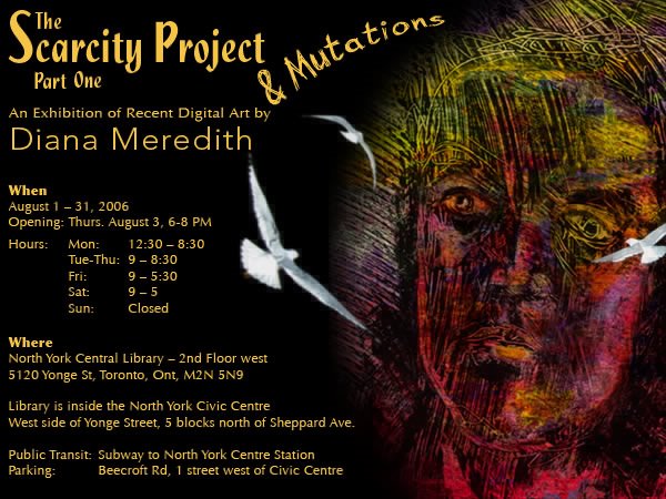
Invitation


If you are in the Toronto area, come and see my show.

Monday, July 17, 2006

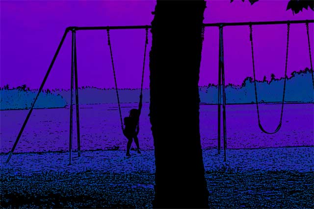
Summer Swing


Oh that easy swing of summer!

Monday, July 10, 2006

Tense Patterns


I'm very fond of patterns - in fact I think knitting and digital imaging have a lot in common. Take a look at a knitting pattern - what do all those little squares remind you of? Pixels! Here a simple cross pattern, some colour changes & the strong shadows define the image.

Sunday, July 02, 2006

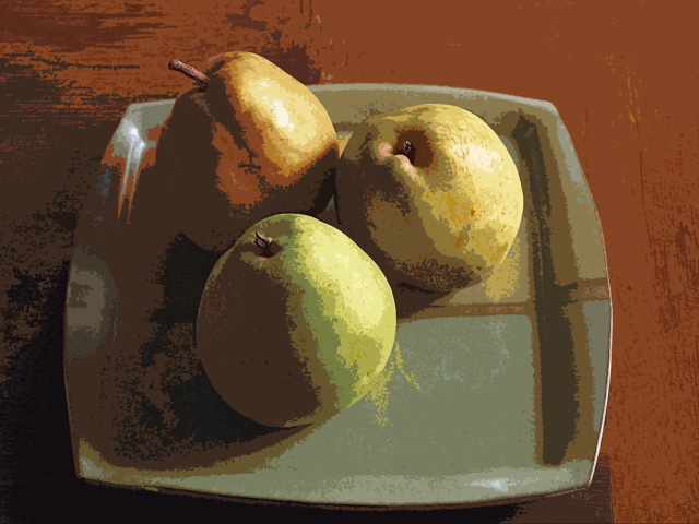
Pears


When I first started creating images, I was surprised at how many artists chose pears as their subject. I finally decided it was for 2 reasons: 1] human models aren't as readily available as fruit and 2] pears are visually very sensual.

Tuesday, June 20, 2006

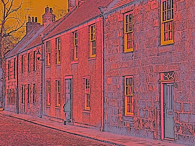
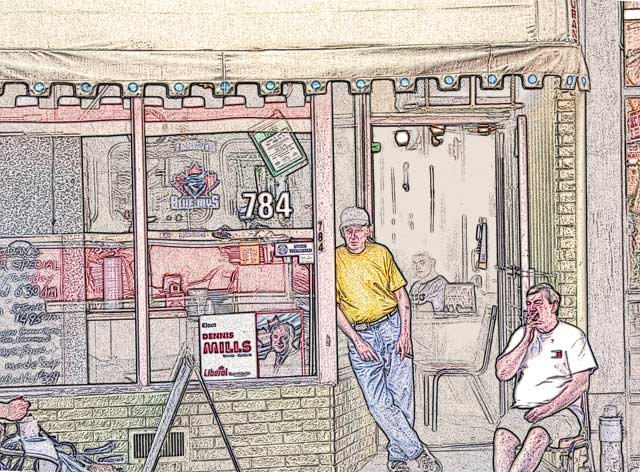
784 Queen St


A moment from the streetcar - with a little Photoshop magic added into the mix.

Tuesday, June 13, 2006

Apple


An apple - with energy.